
A beautiful Landing page has the looks. A great landing page has the looks and also brings conversions!
What is a Landing page?
Before I start talking about the elements of a great landing page, let me explain first what a Landing Page is and how it differentiates from a normal website page.
A landing page is a page where your visitor lands when following a specific campaign, search ad, email, and generally a marketing effort around a service or product you are advertising. A landing page is created for a specific reason and it has a goal; to convert. It is aiming to increase conversions and eventually meet your business growth targets.
Technically any page can be used as a landing page, but unlike the rest of web pages on your website, which have many goals and encourage exploration, landing pages are designed with a single focus and achieve that with the use of a CTA (Call To Action).
Saying that, let’s explore what elements a high converting landing page should have.
#1 Avoid Destructions
First of all, is important to avoid destructions. As said, you should not encourage exploration, i.e. have links to other pages, unrelated content or even fancy visuals for the sake of it. Focus on what you are offering! Too many distractions will impact the user’s focus, distract them and reduce conversions.

#2 Catchy Heading
A headline is one of the most important elements of the page. It’s the first thing the visitor will see and grab his / her attention, make the user understand at a glimpse what the page is all about.
The headline should:
- Grab their attention. Don’t forget that the attention span of humans is very short. In fact, according to wyzowl, the average human attention span has shrunk by nearly a quarter in just 15 years.
- Tell your reader what your product, service or offer is about.
- Make a statement
- Keep it short. Should not be more than 6-8 words. Accompany the headline with an image so you don’t have to go into much detail.

A great example is from mockflow.com, a UI/UX tool, design teams use to visualize user interfaces, create user flows and collaborate for design approvals.
It uses a short descriptive heading with icons to showcase the range of tools is compatible with, a supportive animated image and a clear CTA.
#3 Focus on Benefits and Features
Be descriptive on the features and benefits of your offering. Focus more on the benefits and how you will solve a problem your potential customer has. You can talk about your visitors’ pain and then how they can benefit from your product or service.
For example, as a web design agency, we design websites for other businesses. Our main focus would be on the features of a custom-designed website such as:
- tailor-made
- SEO-friendly
- responsive and so on
but at the same time on the benefits of the business we will create the website for:
- Elevate your business image
- increase your leads
- let your visitors view your website from any device.
Check out supermetrics.com and how they focus on the benefits you will gain when you use their product.

#4 Use Reviews or Testimonials
The purpose of the landing page is to make the visitor take the next step of the sales funnel, and the only way to do that is to build trust. Reviews and testimonials are a great way to do that and build credibility around your brand, product or service.

According to invesp 90% of consumers read online reviews before they buy a product and spend 31% more with a brand that has good reviews.
#5 Use Visuals and Tell a Story
As our brain processes image 60,000 faster than text, visitors will be affected by them as soon as they open the page. You should use relevant, high quality and large images that create emotions and creatively support your message. At BLEND we pay huge attention to the visual aspect of pages and we custom create or manipulate stock photos to make them consistent with the brand, but at the same time create the emotion we want to evoke to the visitor.
#6 Single CTA
Keep a strong Call To Action, make it big and do not forget that this is the most important part of your landing page. Use a big button with a contrasting color that distinguishes it from the rest of the page. The point is to make it eye-catching, so if you can use accompanying graphics, it’s even better.
Avoid forms with lots of fields or buttons with big labels. Keep it short and always remember, it has to Call the user To take Action!
#7 Adapt your LP to your Audience
Focus on specific client profiles with a specific need. You can have one offering but many landing pages with different content or visuals that target different audiences.
Let’s use BLEND again as an example. We build websites! A generic Landing page would not have the same appeal to a fashion designer and an accountant. A different Landing page for each would make more sense. For the fashion designer, we would use bigger images and focus on the design aspect of the website and for the accountant, we would focus more on the business aspect of the website. To the accountants, we would talk with numbers. In other words, we would talk to each audience’s language.
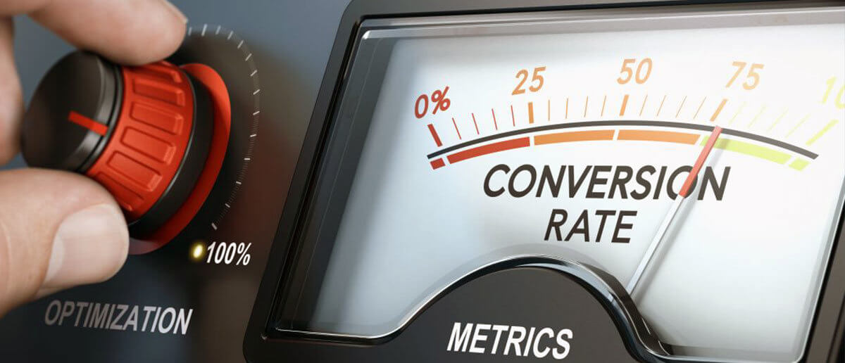
#8 Test and Optimize
You should always test your landing pages and optimize them to increase conversions but also Quality Score. A good way to achieve that is to place heatmaps and undertake A/B testing to identify what works and what does not. Tools like Crazyegg and Hotjar are two of my favorite tools for heat maps and user recordings.
At BLEND we undertake the architecture, design and build of several Landing Pages for businesses. Let us know if you want us to build yours!
Let’s give your business the attention it deserves
Contact us today to arrange a meeting with one of our consultants