

We now live in the Information Age, a period in human history that emerged from the Digital Revolution of the late 20th century. The rapid stream of oversaturated information thrown at us from multiple sources created unpredictable consumers with a short attention span. Merely 3 to 5 seconds. This is how much Brands have in their disposal to engage with their consumers. And this is where User Experience design comes in to provide meaningful and relevant experiences to users. So, how do we blend UX design on mobile apps?
What is User Experience design (UX)?
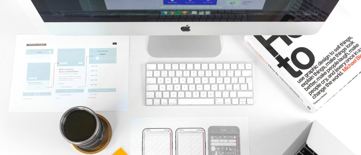
It is a series of research methodologies aimed at understanding the users and their requirements, then designing responses to satisfy them. The goal is to perfect the overall experience of a physical or digital product. Additionally, the aim is to solve user behavioural problems and create useful and delightful interactions.
The digital tech industry has adopted the term “user,” shorthand for “end-user,” to describe what a business manager might call a “consumer.” What does this mean for businesses? The business goal of UX design is to increase user engagement and loyalty through the utility and ease and making sure they find the value they are searching for easily. Without “friction” and with as little guidance as possible. When UX is done well, everybody wins, the users find the product enjoyable, and the product gains massive market shares in return.
“Focus on the user and all else will follow.”
Google

UX designers are primarily concerned with how the product feels and behaves but not necessarily with how it looks like. That’s the job of a User Interface designer (UI). Yet, most small to medium-sized enterprises require a combined job role such as a UI/UX designer.
The goal of a UX designer is to make the interaction as efficient as possible. They have to shift their perspective towards the users’ side and eliminate potential problems by:
- Writing various product user scenarios and building behavioural patterns of interaction.
- Designing user flow diagrams to help build a common understanding of each page of the Website or screen of the Mobile App.
- Prototyping an interface by using the flow diagrams to design wireframes that illustrate the products logic.
- Resorting to various kinds of focus groups, testing and observing what participant users do with the prototype e.g.:
- Internal or external usability testing of the prototype.
- Google Analytics Audit.
- Heatmaps tools.
- Email surveys.
- Recording participant user screen.
- User Eye Tracking (especially on larger screens).
- Competitor analysis benchmarking.

The future of UX
UX has always been a broad category. But soon a designer’s specialization will trend towards new technologies like augmented reality, artificial intelligence, and virtual reality. Good UX eliminates “friction” points and becomes invisible almost like it was never designed. In fact, seamless, frictionless user experience has now become the new standard. The minimum to be relevant in the fast-paced world of technology. If you look at how technology has evolved, it’s all about finding the path of least resistance. In many cases, touchscreens have replaced the mouse. And the voice is slowly eliminating the need to type, or even use your hands at all.
JCCup & JCCup Merchant personal design approach
Due to our vast experience as a web design agency in Cyprus, one of the most exciting and challenging projects that we got our hands on this year was the design of two mobile Apps for JCC.
It was a unique challenge that required us to transform a concept with certain specifications into a wireframe mockup with prototyping tools such as Adobe XD. Once we had a solid prototype that met our clients’ needs, we proceeded to flesh out the design and add that extra “dressing with the cherry on the top”. In addition, we had to prepare all assets in proper order and format for outsourcing development to run as smooth as possible. The fact that it was my first time designing a Mobile App that was going to be used by real users, in a very tight timeframe, added an extra amount of pressure to get it right from the start.

JCCup Consumers App
The purpose of JCCup is to create a cashless and cardless experience for end-users. It is a seamless payment method that completely replaces your wallet. The App uses your device’s camera to scan QR codes generated by JCC and charge your account that was already pre-installed in the App by you. Clean, simple, easy and most importantly the most secure way to pay.
JCCup Merchant App
Just like the Consumers App sends money, the Merchant’s App receives money in the same fashion. This App is designed exclusively for Merchants and Sellers. In its arsenal of tools, Merchant users can create Admins and other sub-users to issue and receive payments and view transaction statistics and other relevant data.

My personal approach
Discovery phase and initial research were based on other Mobile Apps that had similar concepts in terms of functionality and usability. But not necessarily anything to do with finance or gateway payments. One App that stood out from the rest, was the popular music identifier Shazam. What I discovered with Shazam in terms of functionality and usability, was that the entire App was designed around one main function – Identify Music. Likewise, the primary function of JCCup was in essence just one – Pay. That was my starting point and at the same time my end goal. However, for users to get there eventually, we had to design an ecosystem of other secondary support services around the main one for that process to function seamlessly.
6 Key UX design principles used
- Cutting out the clutter by sustaining one primary action per screen. This way it became easier to learn, easier to use, and easier to add to or build on when necessary.
- Making navigation self-evident. Good consistent navigation should feel almost like an invisible hand that guides the user along their journey.
- Designing finger-friendly tap objects. Adjusting the UI to accommodate a very limited screen size by designing objects that are large enough for everyone to tap, since some of us have bigger fingers than others, avoiding frustration.
- Clearly legible content and interface elements. Accommodating UI to smaller screens also means that content has to be at the proper size to be comfortably readable.
- Designed Controls Based on Hand Position. People mostly rely on one thumb to get things done on their phones according to Steven Hoober in his research on mobile devices usage.
- Minimizing the need for extra typing. It’s always best practice to avoid forcing users to type a lot since typing on a mobile device is a slow and error-prone process.

We were happy to get involved in this flagship project and we are extremely proud of the result and now that you know what went behind the scenes, visit the App Store or Google Play Store and experience the JCCup yourselves. Also, have a look at our case study on our website to discover how we designed the brand identity, graphics, illustrations and iconography, the landing page, and the promotional video.